PRESENT FUTURES
PRESENT FUTURES
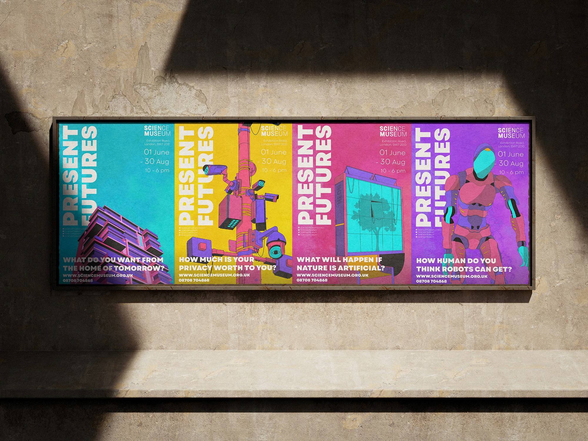
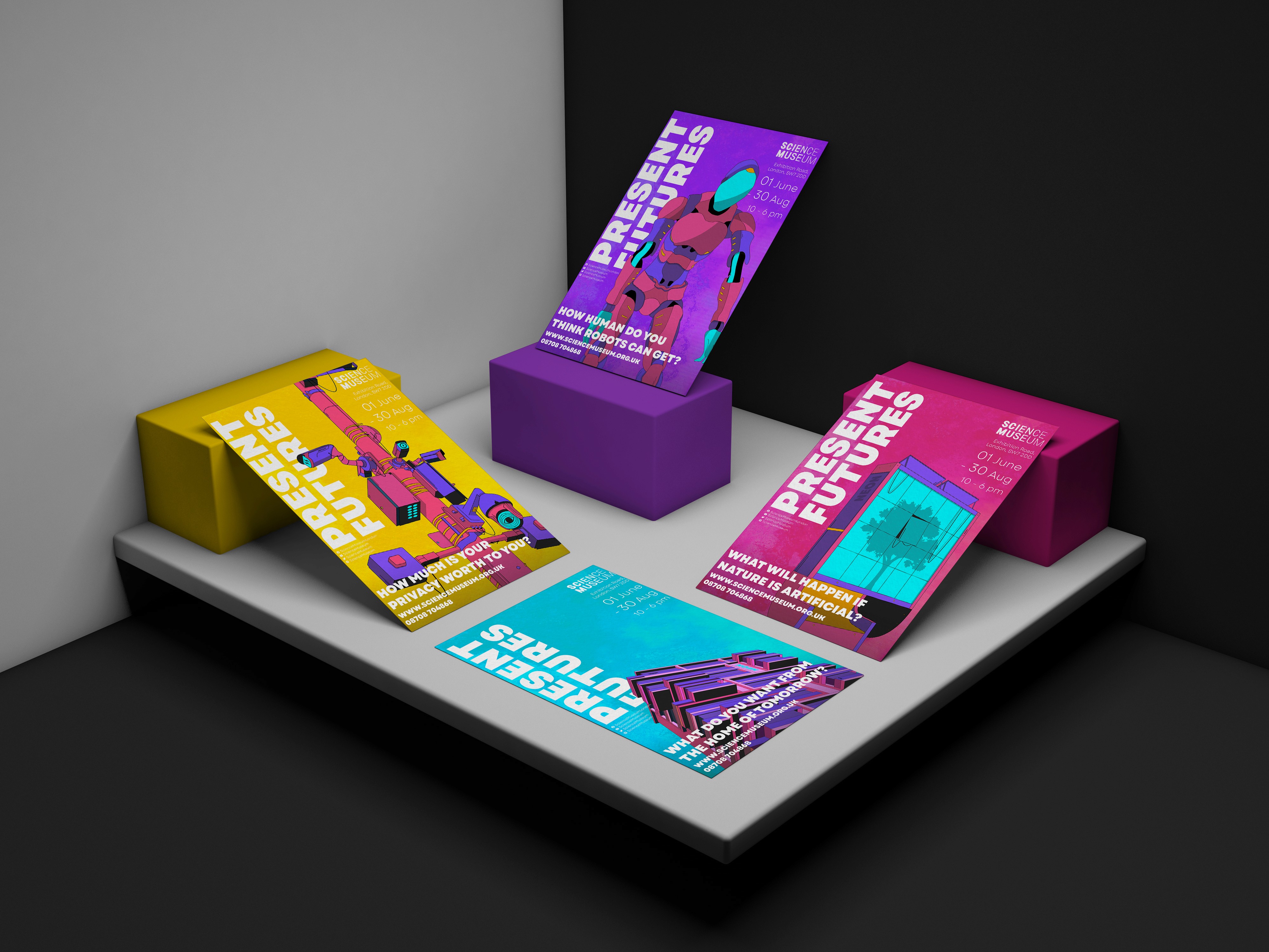
Present Futures is a university project in which I designed some promotional materials for a mock exhibition at the London Science Museum. The exhibition was based around around four key themes; environment, technology, architecture, and society. This is reflected in the four posters I designed.


Research
Research
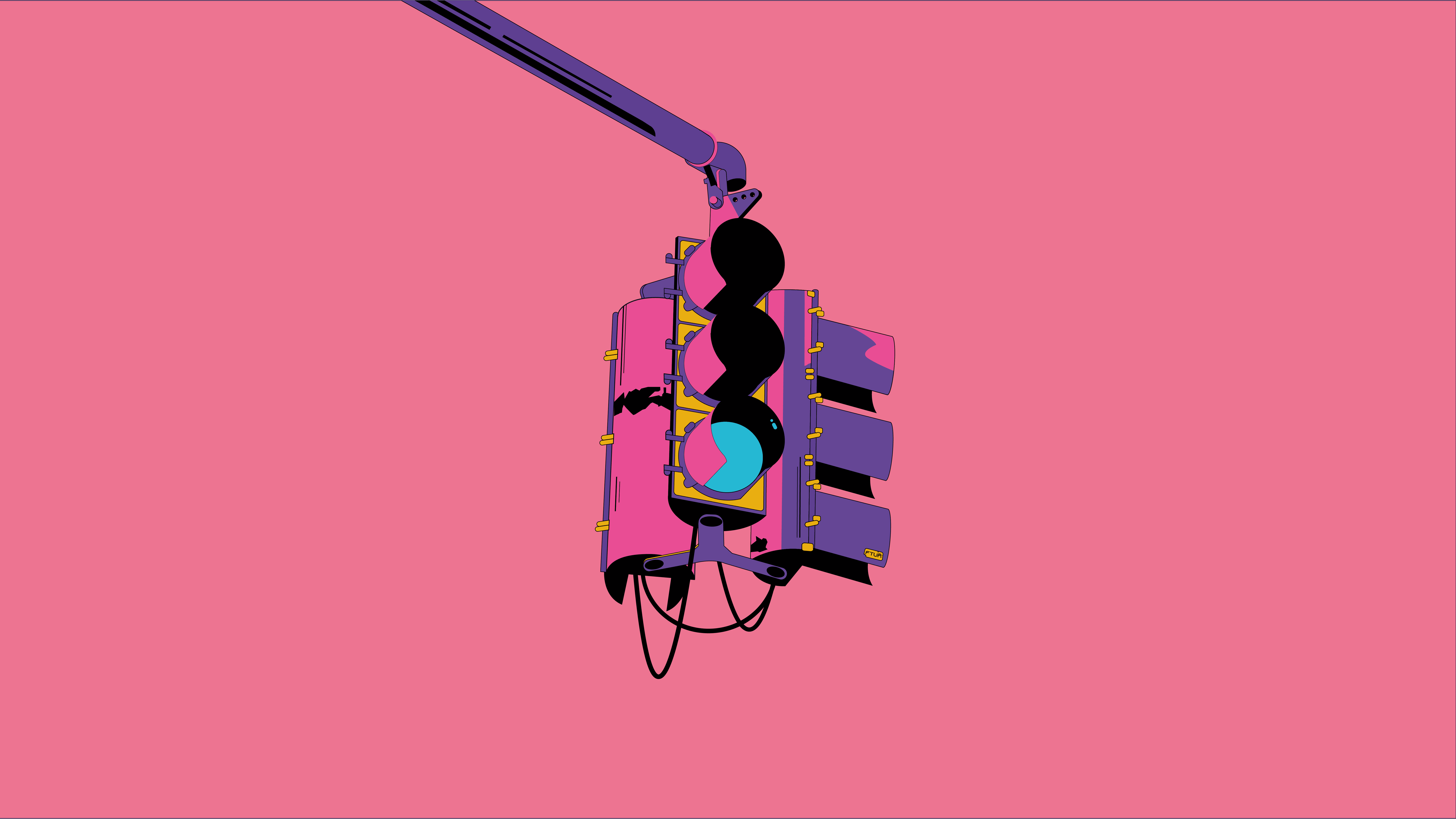
In the research stage of the project, the visual style took influence from comic books and the game Borderlands. This made for an attractive and recognisable aesthetic that linked strongly to the exhibition through themes of dystopia.
In the research stage of the project, the visual style took influence from comic books and the game Borderlands. This made for an attractive and recognisable aesthetic that linked strongly to the exhibition through themes of dystopia.
Research
In the research stage of the project, the visual style took influence from comic books and the game Borderlands. This made for an attractive and recognisable aesthetic that linked strongly to the exhibition through themes of dystopia.
Design
Design
The project employed increased thickness of black lines and heavy use of bright colours established an eye catching aesthetic and clear consistency throughout the outcomes.
The project employed increased thickness of black lines and heavy use of bright colours established an eye catching aesthetic and clear consistency throughout the outcomes.
Design
The project employed increased thickness of black lines and heavy use of bright colours established an eye catching aesthetic and clear consistency throughout the outcomes.
Development
Development
The development of this project strongly revolved around the typography, taking a strong focus on creating an even balance between the boldness of the illustration and the prominence of the text. Legibility and weight were both prioritised to ensure effectiveness as a poster.
The development of this project strongly revolved around the typography, taking a strong focus on creating an even balance between the boldness of the illustration and the prominence of the text. Legibility and weight were both prioritised to ensure effectiveness as a poster.
Development
The development of this project strongly revolved around the typography, taking a strong focus on creating an even balance between the boldness of the illustration and the prominence of the text. Legibility and weight were both prioritised to ensure effectiveness as a poster.


Concept
Concept
The outcomes of Present Futures creates an effective example of how boldness and strong visuals can be applied to create an increase in visual engagement when used in promotion. Although the event is conceptional, the identity is easily identifiable and offers room for expansion.
The outcomes of Present Futures creates an effective example of how boldness and strong visuals can be applied to create an increase in visual engagement when used in promotion. Although the event is conceptional, the identity is easily identifiable and offers room for expansion.
Concept
The outcomes of Present Futures creates an effective example of how boldness and strong visuals can be applied to create an increase in visual engagement when used in promotion. Although the event is conceptional, the identity is easily identifiable and offers room for expansion.




More Work More Work
More Work More Work
SAUL RUSE
SAUL RUSE
SAUL RUSE
SAUL RUSE
©2024 SAUL RUSE
GO BACK TO TOP
©2024 SAUL RUSE
GO BACK TO TOP

