UNIVERSAUL CARDS
UNIVERSAUL CARDS
This project was for a competition by King of Cards, a playing card company. By incorporating my name into the product name, I felt a closer connection to the project as it was representative of myself. In the competition, I came joint first place.


Research
Research
During the ideation stage of the playing card project, I researched a range of playing cards from industry leaders such as Bicycle. This allowed me to identify key themes and design elements to inspire my own work.
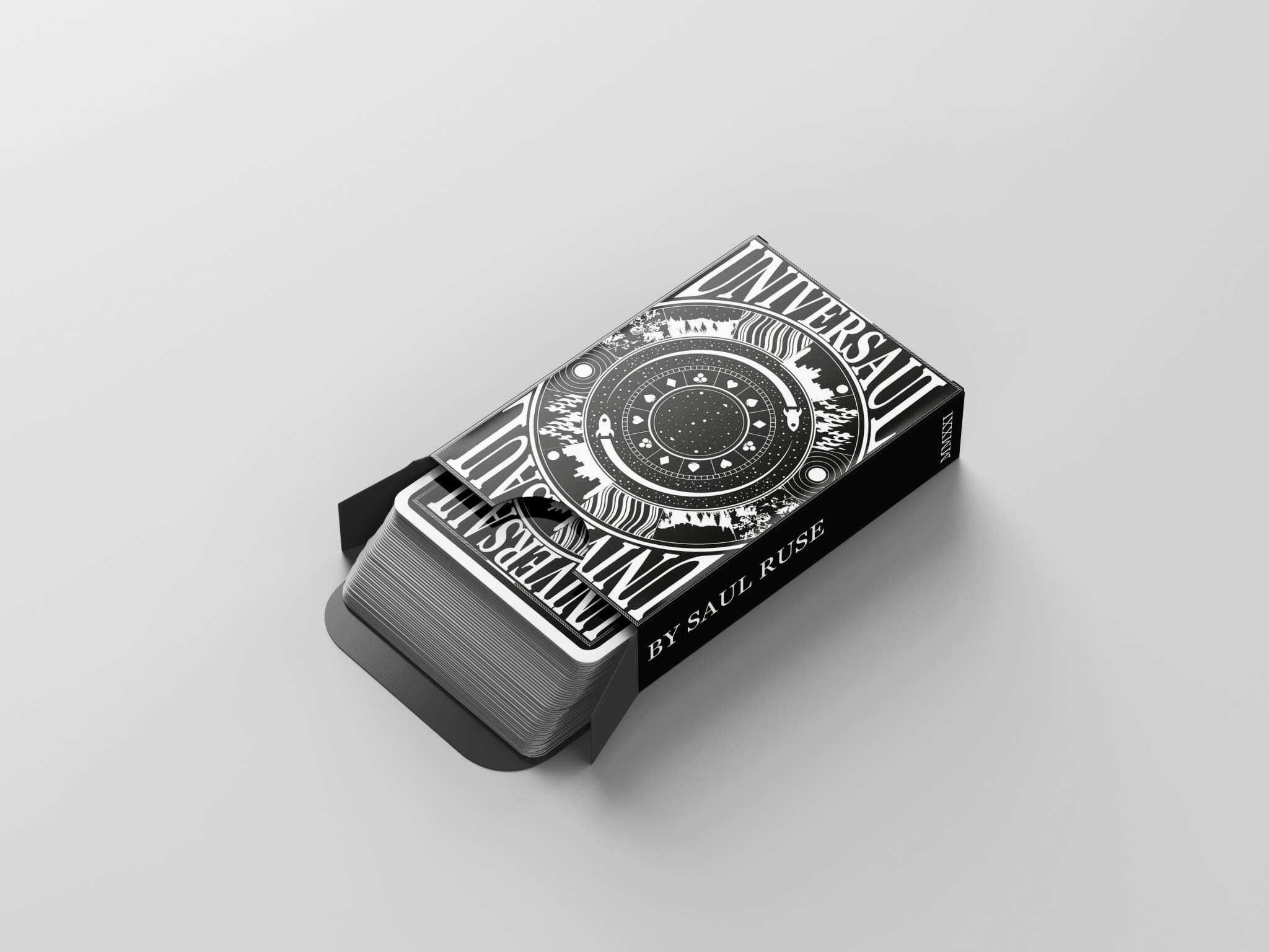
The logo was heavily inspired by the Lucasfilm wordmark.
During the ideation stage of the playing card project, I researched a range of playing cards from industry leaders such as Bicycle. This allowed me to identify key themes and design elements to inspire my own work.
The logo was heavily inspired by the Lucasfilm wordmark.
Research
During the ideation stage of the playing card project, I researched a range of playing cards from industry leaders such as Bicycle. This allowed me to identify key themes and design elements to inspire my own work.
The logo was heavily inspired by the Lucasfilm wordmark.
Design
Design
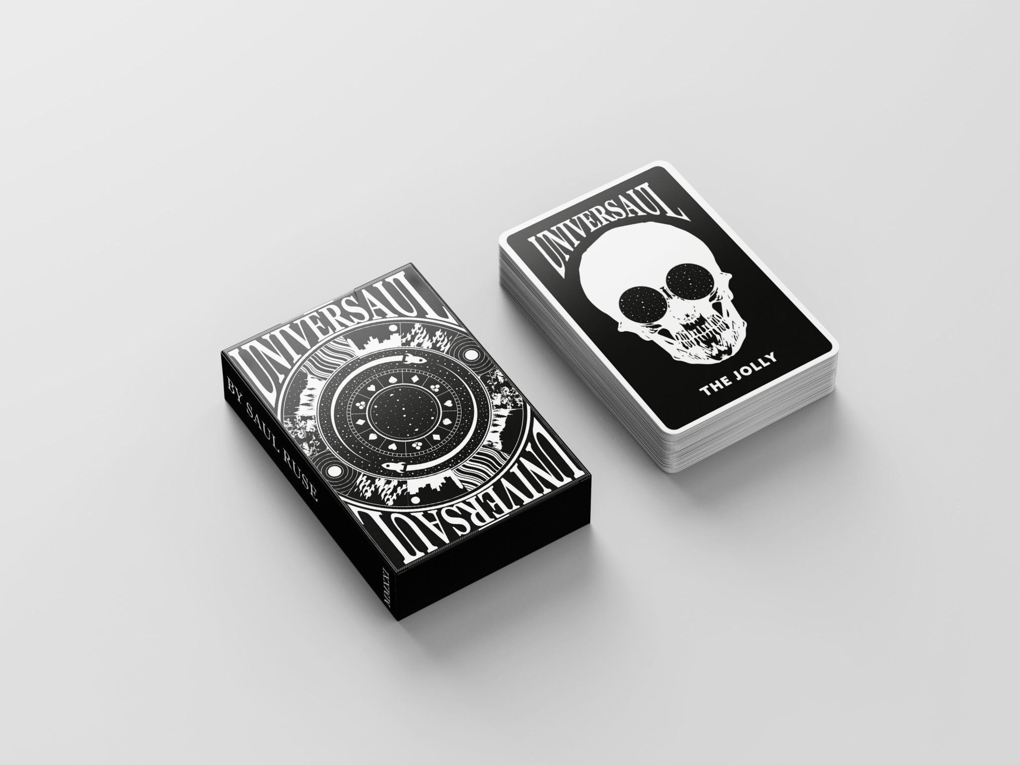
Due to the name of these playing cards being a pun on my own, the elements within the cards are a reflection of my own initial thoughts on the word 'universe'. This involved rockets and wormholes, but also cities and waves. These are all shown within the symmetrical design on the back of the cards.
Due to the name of these playing cards being a pun on my own, the elements within the cards are a reflection of my own initial thoughts on the word 'universe'. This involved rockets and wormholes, but also cities and waves. These are all shown within the symmetrical design on the back of the cards.
Design
Due to the name of these playing cards being a pun on my own, the elements within the cards are a reflection of my own initial thoughts on the word 'universe'. This involved rockets and wormholes, but also cities and waves. These are all shown within the symmetrical design on the back of the cards.
Development
Development
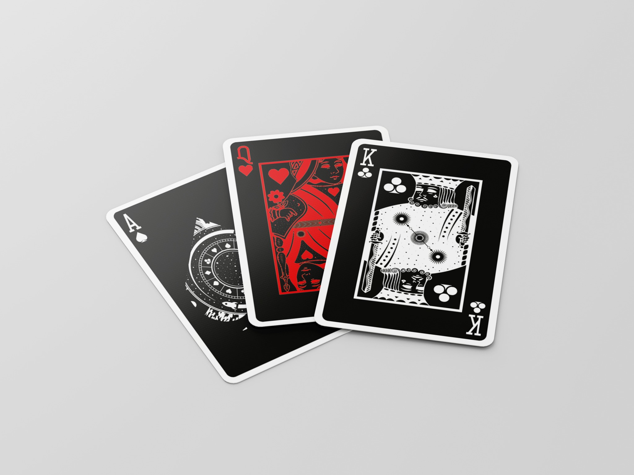
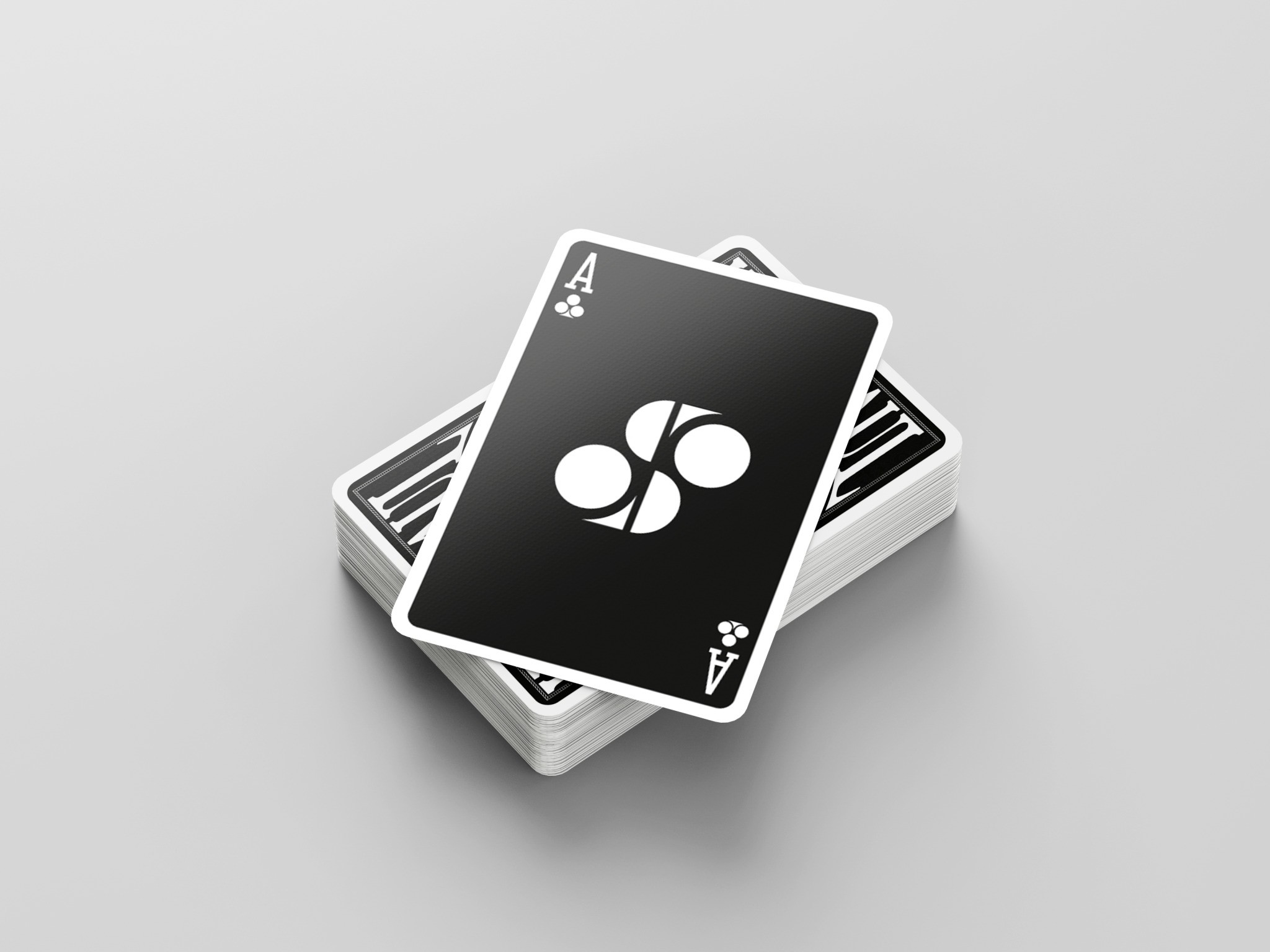
The brief called only for the back of the card to be designed, but the kings, queens, jacks, and aces have also been designed to fit fluidly into the aesthetic. Not only was this achieved with the two-tone colour scheme, but also with fine space-based details within the designs.
The brief called only for the back of the card to be designed, but the kings, queens, jacks, and aces have also been designed to fit fluidly into the aesthetic. Not only was this achieved with the two-tone colour scheme, but also with fine space-based details within the designs.
Development
The brief called only for the back of the card to be designed, but the kings, queens, jacks, and aces have also been designed to fit fluidly into the aesthetic. Not only was this achieved with the two-tone colour scheme, but also with fine space-based details within the designs.


Concept
Concept
The final outcome of the design aimed to be unique in order to inspire conversation within the social setting they are likely to be used. Compared to the stereo-typical card design the average user would be accustomed to, I believe this to be a success.
The final outcome of the design aimed to be unique in order to inspire conversation within the social setting they are likely to be used. Compared to the stereo-typical card design the average user would be accustomed to, I believe this to be a success.
Concept
The final outcome of the design aimed to be unique in order to inspire conversation within the social setting they are likely to be used. Compared to the stereo-typical card design the average user would be accustomed to, I believe this to be a success.




More Work More Work
More Work More Work
SAUL RUSE
SAUL RUSE
SAUL RUSE
SAUL RUSE
©2024 SAUL RUSE
GO BACK TO TOP
©2024 SAUL RUSE
GO BACK TO TOP

